John Miers:
Score and Script
As part of Comica 2012, the 9th London International Comics Festival, the Score and Script Exhibition opened last month at the Centre for Recent Drawing (C4RD), 2-4 Highbury Station Road, Islington, N1 1SB (a few minutes from Highbury & Islington rail & tube). This fascinating exhibition is free and continues until Saturday December 15th, open Thurs to Sat, 1-6pm, admission free. In comics, visual form and narrative content constantly inform and imply one another. But what could be revealed about the process of visual storytelling if an attempt were made to perform that separation? In the Score and Script exhibition, devised by cartoonist & researcher John Miers and co-curated by Megan Donnolley, 23 cartoonists, working either from an entirely verbal description of a single-page story, or a visual diagram based on that same page, present a unique set of answers to that question.
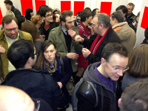
The featured artists are: Andrew Godfrey, Andy Bleck, Andy Poyiadgi, Dan Berry, Daniel Fennings, Daniel Merlin Goodbrey, David O’Connell, Douglas Noble, Elliot Baggott, Gary Northfield, James Hickman, John Cei Douglas, John Miers, John Riordan, Karen Rubins, Kripa Joshi, Mike Medaglia, Richy K. Chandler, Sally-Anne Hickman, Sean Azzopardi, Stuart Medley, Tanya Meditzky and Woodrow Phoenix. Here’s a photo by Richy Chandler from the private view on November 21st - and yes, he’s blanked out the comics on the walls, so that the other artists who are yet to complete their versions can’t see what the others have already produced!
Many of these artists will be taking part on Saturday December 8th, 1-6pm, in a “Santa’s Ghetto” Fair Day at C4RD, where, as well as seeing the exhibition, you will be able to buy comics, graphic novels, zines, objets d’art, hand made box sets of mini-comics, bags, badges, cards, signed prints and art du jour! In anticipation of that, I talked to John about the aims and challenges of this collaborative experiment.
Paul Gravett:
Can you describe how your Score and Script project works and how you arrived at the two distinct instructions for artists to respond to?
John Miers:
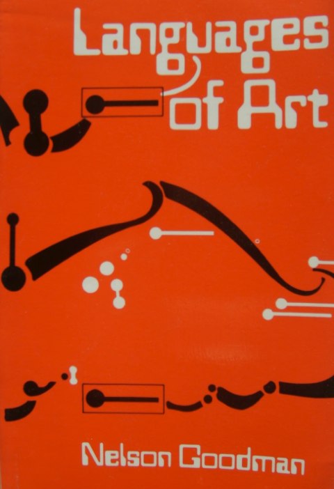
The idea for the project as a whole originally came from a book called Languages of Art (1968, revised 1976, above)) by American philosopher Nelson Goodman. He sets out a really detailed, but flexible, theoretical framework for how different types of sign-system refer to the concepts they communicate. On one end of his scale is notational systems, where every character has a distinct and unambiguous meaning, such as an alphabet. A letter ‘a’ is always a letter ‘a’, no matter how it’s written. And on the other end are systems he describes as “dense”, such as pictures: in any Peanuts panel by Charles Schulz, the same line could be Charlie Brown’s nose or his ear, depending on how it fits with the other lines, and if that line becomes slightly different, it has a different meaning. A wonky ‘a’, on the other hand, is still an ‘a’.
What appeals you about Goodman’s ideas?
I like the fact that Goodman doesn’t try to create rigid boundaries between types of signs - he says that the way a particular sign (which could be anything from a painting to a mark on a graph or a musical note) creates meaning isn’t so much to do with how it looks, but how it relates to other signs in its system. Which I think fits well with trying to analyse comics. When you read a piece of dialogue in a speech balloon, taken on its own, it’s part of a notational system - the characters unambiguously communicate a certain sequence of words. But when you look at how that speech balloon fits on to the page, when you follow the tail to see who it’s coming from or maybe notice that it’s in a different font from the other dialogue on the page, you’re looking at it as part of a dense, pictorial system, and it gets an extra layer of meaning from how it fits into that system. Similarly, when you look at any individual panel, it works as a picture, but gains much more meaning from its relationship to the rest of the narrative sequence, and you start to notice the reappearance of characters and objects in different panels in a way that’s a bit like being able to recognise the letter ‘a’ in different words. When you’re looking at it across the sequence, Charlie Brown’s nose will still be his nose, even if it’s really wonky in one panel.
So when you read a comic, every single part of it is contributing to its meaning in (at least) two ways: as part of a sequence of events, and as part of an overall visual design. These two things come together to create the content, or meaning, of a comic. That was my starting point for the project: what would happen if you tried to separate those two aspects of a comic? If you created two different comics based on the same starting point, but focused exclusively on the sequence of events in one of them, and exclusively on the overall design in the other, would there be any similarity between them, and how would they relate to the starting point?
What made you realise that you were going to have to ask other cartoonists for help?
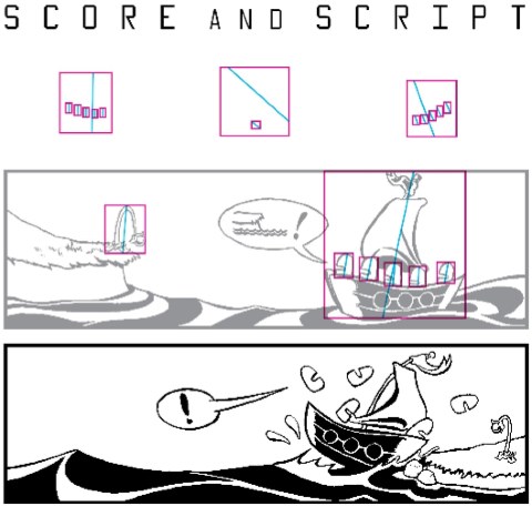
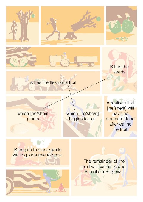
Say if I took an existing comic, and tried on the one hand to redraw the events depicted in that comic, and on the other hand to create a new story using the main design features of that comic, whatever I made would be influenced by the fact that I’d read the comic I used as a starting point. But if I got other people involved who hadn’t seen the starting point, then that issue would be overcome. So I made a one-page strip (above). The Script (below), which half of the artists are working from, is a stripped-down description of the events depicted on the page, leaving out all the visual information. It doesn’t say anything about panel breakdown, colours, setting, the look of the characters, whether they’re male, female, or even human. The instruction I gave them was that they had to depict all the events described in the script in their one-page story, but they could add any other events or details they liked. That was fairly straightforward to make.
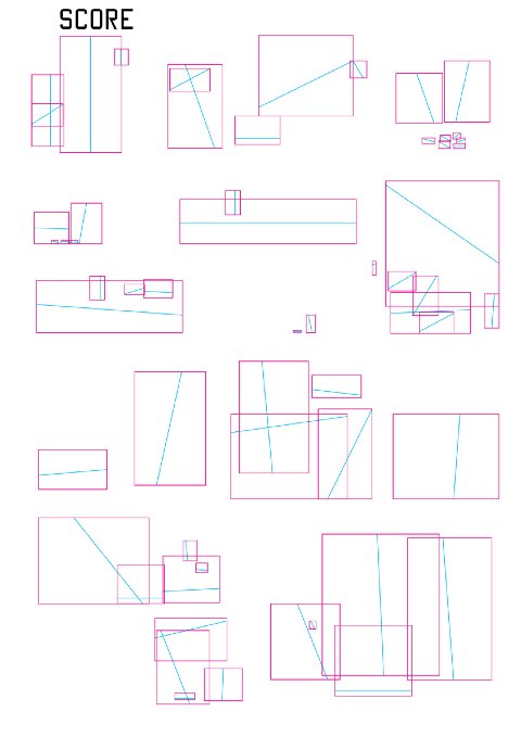
The Score was much more difficult. I knew I wanted to isolate significant visual features of my page, but not give any information about the narrative. The problem was, that as soon as I got into giving even a little bit of detail about the shapes on the page, it started giving away information about the story. Human brains are very eager to turn abstract visual information into meaningful forms. If I say to you, “think of a circle containing two dots above a horizontal line”, even without seeing those shapes, you’ve probably formed a mental image of a face. So I had to come up with some rules about which parts of my page I’d try to transcribe in the Score (below).
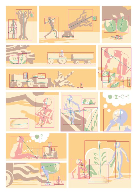
I also wanted to leave it ambiguous enough for the artists working from it to be able to create whatever story they wanted. I decided to leave out the panel borders, as they give too much information about the narrative sequence. I also decided to only transcribe the narrative actors on my page - that is, characters or objects who either do something or have something done to them. So if there’s something purely decorative in the background, it won’t be part of the Score. Finally, I realised that all the information about the actors I could provide without giving the game away was their position, dimensions, and orientation, which I described by drawing a box around them, containing a line showing the central axis. In theoretical terms, this is what the semioticians Groupe Mu call the “first level of plastic form” - the most fundamental parts of any visual sign. The artists working from the Score were asked to put a narrative actor in each box, but could add any other details they liked.
What questions are you hoping to answer with this collaborative project?
The big question at the heart of all this is “what is the relationship between visual form and narrative content in comics?” Which, of course, no single project could ever hope to answer! So to narrow it down a little bit, the Score half of the project looks specifically at how composition, or the visual rhythm of a page, relates to narrative. I don’t mean that I’m expecting any of the Score pages to have a story that’s similar to mine, but I’m looking out for similar movements, or similar physical relationships between the actors on their pages and mine - all of which are significant aspects of visual narrative. The Script pages are more of an opportunity to examine how a range of artists give visual form to, and make a meaningful narrative from, a fairly dry sequence of events. I should also say though that more and more questions that I hadn’t thought of when devising the project suggest themselves to me each time I look at the pages in the exhibition. I think that’s what makes it so interesting - the work in the show might have been made in response to an idea I came up with as part of a research project, but they are first and foremost individual works of art, and could be compared and interpreted in any number of ways by anyone who sees them.
What sort of reactions did you get from the invited artists to taking up this challenge?
Very positive! One thing that I can’t repeat often enough is that the Comica exhibition at C4RD hadn’t been arranged when I originally approached them to take part, so it was just a case of “Can you help me out by giving up your time to create a comic following this ludicrous template I’ve devised?” The generosity everyone showed in getting on board is just amazing. And I think it also shows how keen cartoonists are - or this group of cartoonists at least - to examine and experiment with their favourite artform. I think the fact that it’s a pretty unusual idea for a project appealed to people, and in fact quite a few people specifically asked to work from the Score because they felt it’d be an odd and difficult way of creating a comic. As the show approached there was a fantastic buzz amongst the artists - I’d also asked them not to discuss their responses with each other, to make sure that they weren’t influenced, so their relief at finally being able to compare approaches was palpable!
Which proved more tough - Score or Script?
I’d have to say Score. Not that Script didn’t provide its challenges, but some of the Score artists were pulling their hair out. I hear Gosh! were doing a roaring trade in dartboards with a picture of my face on for a few weeks. Not surprising really, as the Script is closer to a traditional comic script. A really interesting comment one artist made was that knowing that the Score was based on an existing page of mine made it much more difficult. He said he wasted a week thinking “what would John have put in this box?”, and that the page only came together when he dropped that approach. Which, like a lot of things about the results, is an aspect of this project I hadn’t anticipated at all. It also shows up one of the weird contradictions inherent in making practical projects as part of a research process. At Central St Martins College, we’ve had the idea of “research ethics” well and truly drilled into our brains, and one part of being an ethical researcher is that, if you get anyone else involved, you must explain to them exactly how your project works. So with this in mind, I made sure to provide the Score artists with lots of information about how the Score was derived, but it turned out that by doing so I probably made it more difficult for them.
Seeing these first 23 finished strips on the walls of the C4RD exhibition, what have they revealed to you so far?
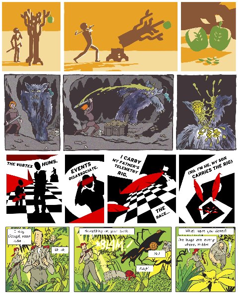
Above are three different top rows of the strip, first the original by me, then others made by John Riordan, Daniel Merlin Goodbrey and Stuart Medley. As I mentioned earlier, these pages could be interpreted in any number of ways, so choosing what to focus on when analysing them is a big part of the process. With the Score pages, there are some really striking correspondences between my page and the artists’ responses, and these are strongest in sections of the Score that relate to panels that have consistent framing. So this seems to support the idea that even very limited visual information is likely to suggest specific forms to people. More generally, a lot of the Score artists produced stories that are more focused on physical action than the work they normally do, which makes sense given that their starting point only provided information about the physical relationships between visual forms on the page. I think they also reflect on how we produce categories of things in order to structure our experience of the world: there’s a particular set of very small boxes in the Score, that almost every artist interpreted (correctly) as representing a group of similar objects on my page. They’re very different things on the various pages - for example spaceships, rats, parasitic bugs, pills, or fish - but quite a few artists have told me that figuring out what to put in those little boxes was their starting point for making sense of their page. This supports the idea that a fundamental way that we understand the world is by creating categories that group sets of objects together, which is a general finding of cognitive linguistics. As I develop the analysis of this project, I want to look more at this idea of categorisation in terms of how cartoonists create categories of visual signs in their work.
And what about the Script pages?
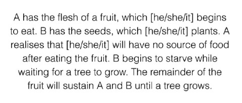
They fit into this framework too. The responses to the Script can be pretty equally divided between people who added extra narrative detail to the events it describes, and those who just depicted the contents of the Script. For example, the first two sentences in the Script are “A has the flesh of a fruit, which [he/she/it] begins to eat. B has the seeds, which [he/she/it] plants.” Some artists added extra events at the start to explain why the fruit was split up in that way, others took it as a given. All the artists who added extra narrative detail used a more traditional, grid-based panel breakdown, meaning that when you look at those pages, the design invites you to focus on the sequence of events. The artists who took the division of the fruit as a given all used page layouts with a noticeable central design feature, meaning that when you look at those, you first notice the overall structure of the page. So in terms of categorisation, I’d say that the first group of artists interpreted the Script as a sequence of causally-linked events, and the second interpreted the whole thing as one unified concept, and that these two approaches to organising the information are reflected through both the visual and narrative structure of their pages.
So where do you plan to take this project next?
As an artistic project, once the artists who didn’t take part in the show have completed their pages, I’ll be putting the whole thing together as an anthology. As a research project, I’ve got a lot more work to do on the analysis, but I think that the write-up of the whole thing will form an early chapter of my PhD thesis. The next thing I’ll be doing is more practical experiments - although I won’t be troubling other artists for help with these! To follow on from the Score, I want to explore this idea of basic compositional structure informing visual content by creating comics based on compositions that deliberately suggest particular physical actions, but then filling them with detail that contradicts the composition, and seeing which visual aspect is dominant in the way the strips are read. To develop the Script, I’m going to pick up on this idea of whether descriptions of events are interpreted separately or as a whole, by creating a pair of comics based around a single description of events, with each comic taking the opposite approach to categorisation. Somewhere along the way I’ll also pick up the melted pieces of my brain and have a nice lie down.
Posted: December 6, 2012