Chris Reynolds Interview:
Mysterious Stories about Times and Places

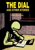
Born in Wales in 1960, unique auteur Chris Reynolds is long overdue for (re-) discovery and wider acclaim. His major works have finally been compiled, edited and designed by Canadian cartoonist and admirer Seth into The New World from New York Review Comics, a hefty and sublime tome of Reynolds’ dream-inspired, dream-inducing Mauretania Comics. Alongside a suite of Reynolds’ short stories, this volume is book-ended by his graphic novels, The Dial from 2004 and the 1990 Penguin Books original Mauretania.

These stories may say an emphatic ‘End’ on their last page, but they never do end; they perplex and intrigue, they blur tenses, past, present and future, the conditional, the hypothetical, the half-remembered. They were and remain ahead of their time, and outside of time. They insinuate themselves like haunting hummings, echoes reverberating, tuning to a frequency of awareness and consciousness of times and places. Mauretania is a strange new world, yet it seems uncannily close to our world, or to a vision about it in a future that is eminently plausible and perhaps already on its way. And unlike much current, science fiction, and SF comics, it seems to avoid dystopianism and high-tech, and hint at a strangely hopeful future.
Chris and I go back to the 1980s, when I spotted the intriguing oddness of his ‘Oceania’ stories in his first self-published comic, and then with Peter Stanbury commissioned a number of new stories by Chris for our anthology Escape Magazine. I could not be happier that today these stories are enjoying a fresh printing and finding a fresh readership in The New World. Once read, Reynolds’ comics never quite leave your head, and never stop stirring you to see how every day your own ‘New World’ is unfolding all around you.
This weekend to launch the book, Chris Reynolds is at the Toronto Comic Arts Festival and on Saturday May 12th is in conversation there with Seth.

Paul Gravett: How did you come to making comics? I gather, in the beginning was the word - reading, and writing your own words. Previously you were pursuing writing and began a novel. What was it like to shift from word-only to the mix of images and texts in comics?
Chris Reynolds: I began with a text novel called Time Off in 1974. This was about a character called Edward Newton, who worked in an office and got involved with Robert Rebor (who had not yet become a child in my stories,) and featured Monitor. It was about exploring a Fritz Lang Metropolis-type city. I kept extending this book to add characters and situations and it acted as a kind of seed-bed for a lot of the material that was to follow. I did even finish this book in the early 1990’s but as a book it was too rambling to be coherent. It doesn’t exist now.
I’ve more recently tried text novels again. Cellarhead is still available online. It’s another one where I put too much in, and it would work much better as a comic. I joined one of those online writing groups and everyone hated everything I did. I wasn’t finding it easy to adapt my storytelling and put in a lot of description to say what was happening. It’s much more comfortable and quicker to do a picture, and the picture is so solid and real for the reader, you can be as ambiguous as you like about what you say and the reader’s not going to feel hopelessly confused. The picture at least will be some kind of anchor for them. In prose, it’s a quick trip to being too ambiguous and losing them. You can get away with a lot in comics, resting on the solidity of the pictures. Especially bold black-and-white ones. The text novel was learning a whole new artform really, and I didn’t have the patience.

What were some of the influences that came from your childhood?
I used to sit next to Malcolm Humphries at school. He has always done comics too. Still working too. Monitor came, probably from Billy the Cat in the Beano comic. But not directly. He was Monsterman first in at least one childhood comic strip. Another influence was those small war comics. War Picture Library and Commando (which you can still get!) When I was about ten, I was staying with my auntie Margaret (great aunt) in Crewe one year, when her neighbour, Mrs Wood, gave me a huge pile of these war comics from her son. Mrs Wood’s son had just joined the army, and she was sorting through his things. Mrs Wood was thinking that it would sound better to him if she’d given the comics to a little boy than if she’d just binned them. Anyway - another stylistic influence. These war comics were worlds of black-and white. And lines in the sky. Shortly after, I went to explore among the derelict railway carriages they used to keep in the sidings at Llandudno Junction, Wales. This was in the 1970’s no-health-and-safety-etc.. And as I was going down there, I remember thinking that this was an atmosphere like I’d seen in those comics, and I expected that I would even see lines in the sky.

I wonder if Commando serves in large part as risk-free, pain-free, blood-free recruitment material to get impressionable lads to sign up?
I never wanted to join the army after reading Commando, although I liked the lives in the stories, where the men just went about having adventures seemingly without a care in the world beyond their military selves - able to escape their personal considerations and just live in the army. Was there ever a reality like that?
We’ve talked about Batman being another formative inspiration…
Yes, I’d been regularly buying Batman comics at Bob Smart’s Fantasy World in Hanley. I found American Splendor in another shop, and was enjoying the stories about Batman spending a lot of time being Bruce Wayne, and involving Lucius Fox and life in Gotham City. I felt I saw some crossovers between this and American Splendor. When I moved to London I liked the Dark Knight Returns, but didn’t like the changes the publishers made to the mainstream Batman comics as a result of its success.

So how did you connect with Escape Magazine, which Peter Stanbury and I began co-publishing in 1983, and Fast Fiction, the UK small press community at that time, and what was your reaction to it?
I bought Escape at Bob’s Science Fiction World, the last A5 one [issue 7] with the orange cover [by Oscar Zarate], but I didn’t send anything off to you, because it looked too “London” and posh and I didn’t think you’d be interested in what I was doing. Paul Harvey took some copies of Cinema Detectives and put them on the indy spinner in Forbidden Planet, London, where you found them and contacted me. You said that the ‘Oceania’ strips in my comic worked better than the ‘Cinema Detectives’ ones, which was true. The line of ‘Cinema Detectives’ strips has always been different to most of my series. Even nowadays, a ‘Cinema Detectives’ strip will tend to be one that I work up “artificially”, as something to do while I wait for a “big” story to spring upon me. I think that even my approach to my ‘Moon Queen and The Bee’ stories is closer to Mauretania Comics than the ‘Cinema Detectives.’
Did you come from an art background? You have mentioned to me Di Chirico and Edward Hopper as artistic influences.
One of my backgrounds is in painting. A Fine Art practical course was what I did at North Staffordshire Polytechnic. I think you’d recognise some aspects of my comics appearing in those paintings. Paintings are not “narrative” enough for me, though. Also “narrative painting” has a deserved bad name, I think. I like to hold people for a little longer than a glance at a painting. I was always in trouble for writing-not-painting at college.
Did you make comics at college?
As students, Paul Harvey and I made some single-copy comics. He did Aspiro and I did Airport Comics. These were full-colour, painted with gouache, and bound like comics. Some of the Mauretania ideas came from them - the AAU cars, and that sci-fi building I sometimes use that looks like a stack of inverted triangles, made their first appearance there. You can trace Paul’s current painting style back to those early comics too. These comics had nothing whatsoever to do with our courses. We did them as personal projects.

How did you and Paul Harvey go from there to start Mauretania Comics in 1986 as an ongoing anthology?
Once, in Stoke on Trent, most of my friends had moved to London and I got ready to follow them there, but before I went Paul Harvey came to visit. I was messing around with comics again and Paul was now working at Forbidden Planet. “I’m starting a new comic,” he said, “and I want you to do some stories for it.” Somewhere in that conversation we came up with the name, Mauretania Comics and it became a joint project. Then ... nothing happened, so I did Issue one of Cinema Detectives using stories which I was submitting as newspaper strips plus, in the back of it, some dreamier strips called ‘Oceania’. This was not an earlier name than Mauretania - I used it to differentiate these strips from the Mauretania comic.
I’m glad we were able to include your work a few times in Escape Magazine.
Yes, I am very pleased you put some of my stories in Escape. It was a much-needed boost at the time. I remember my parents saying Escape looked like a good magazine to get a story into.
Could you tell me more about the short 3-4 line stories you wrote, where many of your characters originated, including Monitor?
I wrote these short-short text pieces at college, also still developing themes of what would become the Mauretania comic-strip stories, although I didn’t know at the time what they would develop into. They don’t exist any more either. We’ve moved so often and got rid of so much stuff over the years, the NYRC were lucky I still had the Mauretania original comics artwork. It’s been a close thing once or twice! Those 3-4 line text stories were the source of some of the early stories. They blended a bit. The only story in the NYRC comic that was originally a text is the Cinema Detectives one that starts on page 86. That one originally came about when we were staying at my grandparents’ and my mum said I looked bored and should write something. This was longer than a 3-4 line job, obviously.
I so enjoyed our evening wander along the seashore in Bournemouth when I visited you in 2012. You told me about your reactions to Seth’s analysis of your work in The Comics Journal. And how he seemed to have understood what you were doing and saying, perhaps more fully than you did yourself?
Yes, Seth looks at me and knows what I’m doing. Seth’s article in the Comics Journal, I thought, drew a line under what I’d been doing with Mauretania Comics. He’d found all the themes and neatened-off everything into a plausible-sounding package, and I thought, “That’s it. That’s what I did. I didn’t know, but I can rest now,” which was lovely for a bit. Seth was dead right in his Comics Journal essay about Monitor having come from somewhere else. It’s been great having had Seth’s support over the years. It’s great having had everyone’s support over the years. My family, Mrs Wood, John Parke, Paul Harvey, Robert Blamire, you and Peter, Ed Pinsent, Mark Baines, Cheryl Blundy, and everyone who’s helped.

How important for you are dreams or daydream to help you make your Mauretania comics? Or do you have other methods to generate stories?
These Mauretania Comics - where they come from - the stories are few and far between these days. I don’t dream nearly as much as I did, and when I do they’re often the same dreams, which I’ve probably already done a strip about anyway. So it’s the law of diminishing returns. So I began doing what I call “created” stories, where I thought “I’ll be a professional cartoonist and just make some stuff up in the ‘normal’ professional-style way.” I was getting ill at the time too, although I didn’t realise, and finding it impossible to draw in the same way I had been. For my lettering, I was shaking while I was holding the pen. I couldn’t do it any more, so I developed a new system I called the “studio system”, where I’d create or re-use a package of artwork and cut and paste that in layers in photoshop (actually gimp) and create the artwork that way. This also coincided with the launch of a lot of new online outlets like Kindle and iTunes so it was a happy thing. I also found that my artwork was quite suited to the dreaded Comic Sans typeface, although I have to manually fix all the exclamation-marks. A lot of the online Cinema Detectives stories are done using this approach.

The writing still seems to me to be the key initial stage for your comics. Do you still do a full script before even starting any drawing?
Nowadays I don’t always do a script first, although I know I generally get a better story if I do. Sometimes I like to just start and let the story go somewhere, then after about 25 panels “reel it in.” Coming up with a new Mauretania Comics story for ArtReview [scroll below], however, was not as straightforward as you might think. Luckily I’d just been out and about in the very early morning and been on a bus where a lot of children were on their way to school, and so I saw a lot of stuff I could use. So I put in the references to girl’s comics, super-powers, mutant superheroes, Superman’s phone box and that stuff. Those “half-phone-boxes” are real - and guess what, they’re called “New World” payphones!
I can imagine Seth looking at the ArtReview story and saying “Classic Reynolds Intuition vs Reason here. The children are having their individuality crushed by a rigid society and are possibly being made unable to meet the challenges of the future as a result.” And I’d say, “Oh yeah, you’re right,” and Seth would muse,“That poor little girl who thinks invisibility is the best super-power…” And even though it’s a bit dystopian, the people in that story may have had a happy life.


‘We’re Early’ for ArtReview Magazine
Click images to enlarge.
Mauretania is a strange land, it seems uncannily close to our world, or to a dream about it in a future that is plausible, and perhaps already on its way. And unlike much current, science fiction, and SF comics, it seems to avoid dystopianism and bleakness?
Yes, I don’t like to be too dystopian. And Ed Park’s remarks about Christianity in his introduction to The New World were a bit unexpected to me. I suppose it’s there. I like hi-tech but don’t really get on with a dystopian future apart from as a source of atmosphere. In any of my stories you can take it from me as author that things came out OK in the end.

Your art was described as ‘black and white and black’ by the poet Ed Park who introduces The New World collection. Where does this very dark and inky style derive from? And the quite heavy black borders on your panels? What effect and mood do you hope to create with them?
About stylistic choices with the black outlines, the thick black lines and the wavy text boxes are all about me trying to overcome my shortcomings at draughtsmanship by having a kind of hefty statement on the paper before I even begin drawing. They come about from a variety of sources. The black outlines probably come from when I used to do Super-8 films. I read that if you make a screen with a black outline, it creates a better look of colour and depth, and could even give the films an impression of 3D. So I thought that I’d have that in my comics. With the black and white, a lot of this of course came from the notorious Commando and Air War Picture Stories, but I was also going for a similar look to the “crushed blacks” of some black-and-white films. I hope both those things contributed to the mood. I moved on to colour later, because Laura suggested I do so. She thought I was missing out by being B&W only, and I do enjoy working in colour now.
And same with the 9-panel ‘waffle’ grid of your pages (or 4 panels of course in the Mauretania graphic novel) which tends to dominate you comics - why do this? What effect does it have on how you create your work and on your readers’ experience?
For the 9-panel grid, I did that rigidly because otherwise I thought readers would wonder why I’d varied it, and what that meant. It’s a matter of comics grammar for me. And now, with online comics I design them for one-panel-per page and have moved on to square format, because it’s more flexible in terms of viewing landscape or portrait on a device. And they will still make up into 6-panels per page for printing. The only technical difficulty with this is that now the title pages are taller than the body pages, so the body pages can look a bit low on the page. Suggestions on how to overcome this are welcome!
I don’t know of any artist who consistently uses the undulating wavy line to enclose their narrative captions as you do. It’s an effect otherwise used on the frames of panels to indicate a shift into a fantasy or dream of course. Or perhaps it suggests some reception of a transmission - but a softer one than the usual jagged saw-tooth line you would use in comics? What do you want this approach to convey?
For the wavy-lined text boxes - these stories are heavy on the description, so I felt the areas of text needed a little something to not be too bleak. Those text areas, and the wavy lines - when I did them I wanted to add visual interest, so that the text wouldn’t be in a straight-sided box. I was thinking that the eye needed help not to be slid away from the text by straight edges. I made a cardboard “comb” to create the initial lines, then went over them, thicker, by hand.

Penguin books, publisher of Maus, commissioned a similarly sized, similar length paperback graphic novel from you, published in 1990. That was quite a break, and also a challenge to develop a full-length graphic novel, after working on short stories. How did that commission come about? Who was your Commissioning editor?
Yes, the Penguin book was great and you and Peter Stanbury had a lot do do with it. Your original idea was that I might approach Penguin with a view to doing a graphic novelisation of Susan Hill’s Woman in Black, but I also sent them a copy of Mauretania Comics number 4, which had some very good stories in it, and so then the project became to do something original. I remember getting the phone call saying they’d be doing it. It was great. Ravi Mirchandani from popular science and Geraldine Cooke, boss of the crime section, were my editors.

Were you given free rein and left to your own devices, or did Penguin give any feedback, directions or editorial changes?
I was left to my own devices. I did a panelised script which they approved and then I spent the next nine months drawing it. I carried that artwork all over the country with me. I kept it close. I wouldn’t even leave it in the car at motorway service stations. I remember rebuilding a wall at my parents’ and thinking I had to be extra careful not to bash my fingers with the stones, because I had to finish that story. They only requested one spelling mistake change and one change to a drawing they thought didn’t work. Also they needed reassuring about the pacing when Susan first starts at Reynal.
I always joked (badly) than Penguin chose you because Mauretania would sit alphabetically next to their best-seller, Art Spiegelman’s Maus!
Yes, it was on the shelves next to Maus! The old Dillons chain of bookshops always seemed to make a good display of it whenever I’d see it in one of their branches.
There is a distinctive feeling of mystery, intrigue, nostalgia, a dream-like unfolding of stories, and an unique atmosphere to many of your comics. And yet they also seem grounded in our ‘real’ world too. In what ways do your everyday experiences, the world around you, impact on or inspire your writing and imagery for Mauretania?

What I wanted to do, even back in 1974, was to preserve different atmospheres about what I felt about certain places, and about the atmospheres of certain dreams. I thought these were too sweet not to preserve in some way. I didn’t want them to get just washed away - like - uh- “tears in the rain”… Another thing about preserving the sense of a place through art: I used to think that those feelings of places were real and that everyone else was feeling the same thing about somewhere. But it took me an extraordinarily long time to realise that those feelings were totally subjective. Even when I go back somewhere I knew as a child - going back for the first time as an adult now - the feeling is different. The feeling wasn’t part of the place at all. It was just me that was having it - or was it?
All media have their strengths and weaknesses. What have been your experiences of creating in other media, for example film?
At college, I tried Super-8 with films of going along, exploring, set to music, happy explorative films in the sunshine with that glorious Super-8 colour. Then, of course I told myself that one day I’d do a proper film if I ever got the money. I got the money in the 1990’s and found out a lot about film production, making Hunters of the Sun - (you can see it on YouTube - or at least a 5-minute version.) There are three big problems with making a film. One, it’s expensive. Two, there’s so much logistical planning involved there’s precious little room for creativity, Three, there’s nowhere you can really sell them. There’s a big step you’ve got to make to get onto a distribution platform that means anything. Four (OK more than 3!), the speed of the storytelling in a film is constrained by the speed of the projector. You only get one shot at experiencing it and I realised why films are made the way they are and the sorts of straitjackets the medium forces you into. Let me get back to my comics! Five, you can’t just lightheartedly set off and do a film like you can a comic. I got into those experiments with films, and prose novels too, because I thought they’d be easier than doing comics. Ha ha ha!! Painting is OK. I also have some good painting ideas, but they’re rare and I haven’t got the interest to persist with it, like you have to when you want to get anywhere with anything.

I also wanted to relay that I have so enjoyed the stories in your new colour compendium of Mauretania Comics entitled Torus available at Lulu.com. I’ve read some out loud - some beautiful writing here. The haze (of the future or of the past?) of shifting time and memory and place. Altered perspectives, elusive and allusive. Or ‘No one knew about it. Not even me’ - and yet the narrator has been telling us all about it! I cannot recommend it too highly to everyone who wants to read more after reading The New World. One puzzle, why the title?
I’m so glad you liked Torus. The ‘Torus’, meaning a shape with a hole, is a couple of jokes about The New World book, firstly because the font on the cover of that has no holes, also Torus was originally going to be just the old B&W stories left over, after Seth had taken most of them for The New World, so I was thinking of it as the comic with the big hole in the middle.
I wanted to raise the interesting effect of your use of ‘END’ in the final panel, moved to the bottom right. Of course ‘END’ tells you that is as far as the story goes and suggests some sort of reassuring conclusion which actually is seldom really there…
Yes, ‘END’ is clunky, but it has to be there because the stories are meant to be self-contained and it would give the wrong effect for them to run-on. I’m glad you were reading them aloud. I put a lot of the strips about rhythms and recorded music close together.
I do miss the more wobbly, human-drawn and thicker panel borders to the perfect, mechanical and thinner ones you use more recently. Something is lost a bit imho. Still, you are still making truly remarkable, hypnotising comics.
I changed my drawing style because I wasn’t able to do my lettering any more because my hand was getting too shaky. That led to me having one of my times of “giving-up” doing comics and mentally “drawing a line” under them. Then I decided what I’d most like to do next was to draw some comics - but I was going to completely start again with no reference to the previous ones apart from re-using some of the characters. It was very refreshing.
And what’s next?
The Storm Train Seven book is out now on CreateSpace. It follows on with the trains from Torus, where the sinister little toy train has come out of Monitor’s house, and from Monitor’s decision to have more to do with more traditional superheroes. It’s also got the other ‘Golden Age’ story in it.

Photo of Dylan Horrocks’ Collection courtesy of & © Dylan Horrocks.